top of page

THE ARENA
Redesigning Agency-Client Collaboration :
A Strategic UI/UX Transformation Using Jobs-to-be-Done Framework
Project Overview
My Role
UI/UX Designer
Team
6 members
Timeline
15 weeks
Tools
Adobe XD, Miro
PROJECT DESCRIPTION
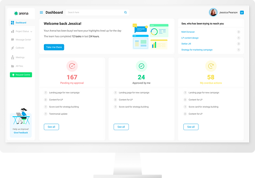
Arena is a B2B campaign collaboration platform redesigned to help agencies and clients understand project status at a glance.
I led a decision-driven UX transformation grounded in Jobs-to-be-Done, focusing on clarity, prioritization, and workflow alignment rather than feature expansion. The result was a shift from a navigation-heavy tool to a decision-support experience that improved adoption, reduced status overhead, and restored client confidence.
01
The Challenge: A Functional Tool Nobody Loved
On paper, Arena had everything agencies needed: campaign timelines, task management, and approval workflows. In practice, it created friction instead of clarity.
Key Insights
Critical information was buried across multiple screens
Users had to navigate before understanding status
Visual hierarchy was weak, making prioritization difficult
Agencies felt uncomfortable presenting the tool to clients
Clients reverted to email for approvals and updates
This wasn't a problem that more features could solve. This was a problem that required understanding what job users were actually hiring The Arena to do.
This was not a feature gap. It was a decision‑support gap.
02
Research & Discovery
I joined the project with one advantage: fresh eyes. I hadn't been part of the original product decisions, which meant I could question everything. My first two weeks were spent immersed in understanding, not just what The Arena did, but why it existed in the first place.
Studied requirement documents and feature specs to understand the intended vision
Examined earlier prototypes to trace the evolution of design decisions
Used the live production system extensively, noting every friction point
Conducted knowledge transfer sessions with product and tech teams
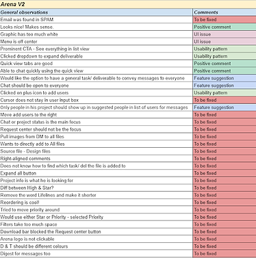
Created a comprehensive audit document cataloging every UI issue
The Old System: Audit


Heuristic Evaluation
I began with a systematic heuristic evaluation using Nielsen's 10 Usability Principles to audit Arena V2. This formal assessment revealed violations across multiple heuristics.
Heuristic Principle
Score (1-5)
Key Issues Identified
Visibility of System Status
No loading indicators, unclear save states
Match System & Real World
Technical jargon, inconsistent terminology
User Control & Freedom
No undo/redo, difficult navigation back
Consistency & Standards
Inconsistent components, no design system
Error Prevention
No confirmation dialogs, easy mistakes
Recognition vs. Recall
Hidden features, unclear iconography
Overall Severity: CRITICAL (Average Score: 2.2/5)
03
Conclusion from Usability Session
Account Manager

Client Marketing Manager
.png)

04
Defining the Job: What Users Really Needed
After weeks of research, I could finally articulate what users were truly hiring The Arena to accomplish. This became our North Star—every design decision would be evaluated against this job statement:
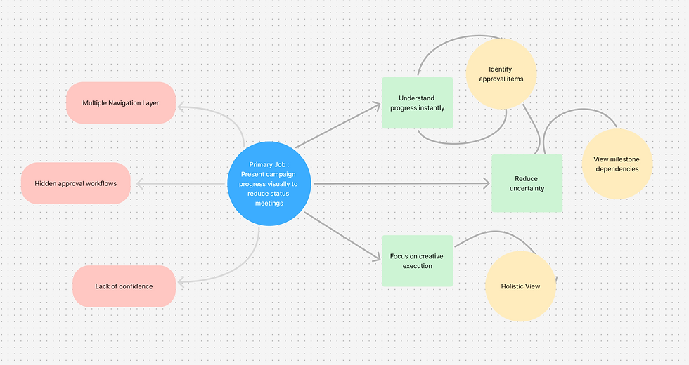
Primary Job
When agencies manage multiple client campaigns, they want to present progress in a visual, timeline‑based format that gives clients immediate clarity and confidence, so they can reduce status meetings, minimize anxiety, and focus on creative execution.
Supporting Jobs
Enable clients to quickly see what needs approval
Help teams identify dependencies and risks early
Provide stakeholders with a holistic view of all campaigns
05
Design Strategy: Principles That Guided Every Decision
With the job clearly defined, I established four core principles that would guide every design decision:
Principle
Application
Information Before Navigation
Critical information should be immediately visible without requiring navigation. Users should see what matters most before deciding where to click.
Visual Hierarchy as Communication
Use size, color, and position to communicate priority and urgency, not just organize content. What looks important should be important.
Microinteractions as Confidence Builders
Every interaction should provide immediate, clear feedback. Users should never wonder 'Did that work?' or 'What's happening now?'
Professional Polish as Trust Signal
Modern visual design builds confidence in both the tool and the agency using it. Aesthetics aren't superficial—they're functional trust signals.
06
Redesigning the Workflow: From Clicks to Clarity
The biggest insights came from comparing intended user flows with actual user behavior. The gap was massive.
The Old Workflow: A Study in Friction
Step 1
Logs in to Arena
Sees generic dashboard
Step 2
Clicks 'Project Status' in
sidebar navigates to new screen
Step 3
Sees list of campaign names
No visual status indicators
Step 4
Clicks first campaign name
Another page load
Step 5
Scrolls through long task list
Looking for Priority
Step 6
Can't find important Tasks
Returns to previous screen
Gives Up
Total time to get campaign overview: ~90 seconds. Number of clicks: 7+. Success rate: 40%.
The Redesigned Workflow: Clarity at a Glance
Step 1
Logs in to Arena
Immediately sees card-based campaign overview with visual
Step 2
SUCCESS scans
Dashboard at a glanceSees: progress bars, status, upcoming milestones, priority flags
Step 3
Click card for detailed timeline
Expands inline (no page reload)
Total time to get campaign overview: ~15 seconds. Number of clicks: 1. Success rate: 95%.
The Redesigned User Flow

07
Visual Design: Crafting Trust Through Details
The Color Strategy: More Than Aesthetics
The existing brand colors needed evolution. The two-color system lacked sufficient contrast to create effective visual hierarchy. I proposed three color schemes to stakeholders, but I didn't just show them swatches, I implemented each scheme in real content.
I designed Arena's upcoming email campaign in each color scheme. This let stakeholders see how colors performed in actual context rather than abstract examples. The difference was clear: some schemes that looked great as swatches fell apart when applied to real content.

Existing color scheme with tertiary color

Option -1

Final
The Strategic Addition: Tertiary Color
The winning scheme included a strategic addition: a tertiary coral accent color. This wasn't about having more colors, it was about creating a functional hierarchy:
Main brand color for navigation and primary actions
#30A4E2
#F6E468
Critical actions, warnings, and attention-required indicators
Supporting elements and secondary actions
#42DE7E
08
Building the Design System
A consistent visual language was crucial for both user experience and development efficiency. I created a comprehensive design library in Adobe XD that became the single source of truth for the entire product.
The design system included:

Component Library: 50+ reusable components (buttons, forms, cards, modals, navigation, badges, alerts, tooltips)

Typography Scale: Clear hierarchy with 6 heading levels, 3 body sizes, captions, and labels

Color System: Semantic naming (primary, secondary, success, warning, danger, 5 neutral tones) with accessibility-checked contrast ratios
09
Micro-interactions: The Details That Build Confidence
One lesson I've learned over the years: users notice when something feels right, even if they can't articulate why. Micro-interactions are often that difference.
Approval buttons animate on click with a subtle scale and color shift, confirming action receipt
Adding favourite was never this fun before
Message badges pulse gently when requiring attention, drawing the eye naturally without being distracting
Loading states provide specific context ('Loading campaign assets...') instead of generic spinners
These aren't decorative flourishes, they're functional confidence builders that reduce user uncertainty and make the system feel responsive and alive.
10
Final UI


10
Design Tradoffs : Where I Had to Choose
Real design doesn't happen in a vacuum. Every decision in this project came with a cost. Here are the honest trade-offs I navigated across 7 months and why I made the call I did.
Rebuild from Scratch vs. Respect the Codebase
Complete redesign with fresh IA, navigation patterns, and a modern interaction paradigm.
A progressive UI refresh that worked within the constraints of the existing technical architecture
Why I chose this
The dev team had already built a significant portion of Arena V2. A full redesign would have meant throwing away months of work. I treated the existing screens as wireframes and elevated them, delivering a better experience without derailing the roadmap.
What I'd do differently
I would have pushed harder in discovery to quantify the total rework cost vs. redesign cost and presented a phased redesign roadmap to stakeholders.
Impact on UX :
Delight vs. Feasibility
Fully animated, physics-based transitions and gesture-driven interactions.
Curated set of purposeful micro-interactions focused on feedback states.
Why I chose this
Some transitions I prototyped were not feasible with the current React library. Rather than designing for a hypothetical build, I designed for the team in front of me — prioritising interactions where the UX cost of removing them was highest.
What I'd do differently
Establish a 'feasibility flag' system during prototyping (Tier 1 must-have vs Tier 3 aspirational) to make dev conversations faster.
Impact on UX :
Perfect System vs. Shipping
Fully documented, token-based design system with component variants, accessibility specs, and usage guidelines built before any screen design began.
Build-as-you-go approach: establish core design tokens (color, typography, spacing) first, then add components to the library incrementally as they appeared in actual user flows.
Why I chose this
With a 7 month timeline and developers building in parallel, there was no room for a dedicated design system sprint. The team needed screens immediately. I locked the core foundations first such as color, type, and spacing, then built components as real use cases emerged. This just in time approach allowed us to ship fast while creating reusable patterns, avoiding delays that a full system sprint would have caused.
What I'd do differently
I would invest 2 to 3 weeks at kickoff to build a minimal design system covering the 10 to 15 most common components. The retroactive consistency fixes in month 5 cost more time than an upfront sprint would have. I would also create a simple one page usage guide to prevent developers from improvising styles in my absence.
Impact on UX :
11
Validation & Impact: Measuring Success
With a fully interactive prototype built in Adobe XD, I returned to our original test users. Same people, same tasks, completely different results.
Time to campaign status overview
~90 Second
~15 Second
40%
95%
Task completion success rate
Approval workflow completion (first attempt)
~60%
~98%
User satisfaction score (0-10)
Navigation errors per session
3.4
6.2
8.7
0.2
Metric
Before
After
12
Business Impact
The redesign delivered measurable business value beyond user satisfaction
83% reduction in time spent on status updates : Average status meeting duration dropped from 30 minutes to 5 minutes
3x increase in client login frequency : Clients now check Arena daily instead of weekly, reducing email back-and-forth
Improved sales conversion rate : Visual design now comparable looks trustful, no longer a objection in sales demos
Scalable design foundation : Design system enables 40% faster feature development with consistent quality
Reduced support tickets by 35% : Clearer UI and better feedback reduced confusion and user errors
13
Key Learnings: What This Project Taught Me
1. JTBD as a Strategic Filter, Not Just Framework
The Jobs-to-be-Done framework wasn't just a research tool—it became our decision making filter throughout the entire project. When stakeholders requested additional features or visual changes, we had a clear test: "Does this help users get campaign status faster? Does it make approvals more frictionless?"
If the answer was no, it didn't make the cut. This discipline prevented scope creep and kept us focused on outcomes over outputs.
2. Visual Design Builds Trust in B2B
Agencies reported that the improved visual design made them more confident presenting the tool to clients. That confidence directly impacted adoption rates. When stakeholders choose tools that reflect on their professional judgment, aesthetic quality carries functional weight. It's a trust signal.
3. Collaboration Multiplies Design Impact
The best outcomes came from deep collaboration across disciplines. Regular sessions with the product lead ensured strategic alignment. Partnership with the senior UX designer brought valuable perspective on interaction patterns. Consistent developer check-ins prevented implementation surprises.

bottom of page